I didn’t start consistently make money until I started to use Bollinger Bands
Over the years, I’ve utilized many different indicators, testing them with paper trades, back testing them, test them by trading with real money …you name it.
I’d make money with some…lose money with some; then start to lose money with the ones I used to make money with!
For some reason, I kept coming back to Bollinger Bands and finally started to focus on how to use them. I’m glad I did, because ever since, I’ve been much more successful with my swing trades.
I first started trading Bollinger Bands without even knowing much of the detail behind how they were calculated, why they moved the way they did, but over time, I started to get a feel for how they interacted with the current price of the stock I was buying or selling. I used them mainly to buy swing trade reversals and I noticed that they definitely helped me confirm I was making the right decision to buy at the right time.
At some point though, I decided to really look into what make Bollinger Bands tick, how they are calculated, how to use them, and just how the heck did they even get that name anyway? When I did that, and finally put it all together, my trading entries and exists started to really become more accurate. I used commonly popular Bollinger Band techniques, but like any trader, customized my own method to utilize Bollinger Bands that work best for me.
What are Bollinger Bands? Who created them?
Bollinger Bands were created by, of all people, someone named…John Bollinger. He’s a financial analyst, technical analyst, author of articles and books. He created his technical analysis tool currently known as Bollinger Bands, in the 1980’s. John worked at the Financial News Network (which later merged with CNBC) as their on-air technical chart analyst. He had developed his unique approach of using standard deviation to create visible bands around stock movements and was once asked by the host of the show on-air, Bill Griffeth, and he said, “Let’s call them Bollinger Bands.”
They say a picture is worth a thousand words. What we have in a nutshell, is an elegant visual representation with a statistical formula behind it. The Bollinger Bands tell you whether you are buying low or selling high AND whether that is a high or low on a relative, statistical basis.
Basically, the price is high at the top line of the Bollinger Band and the price is low at the lower Bollinger Band on a RELATIVE basis. The upper and lower bands expand, when volatility expands. These are the two keys to understanding Bollinger Bands and how to use them.
It took me a long time to finally realize why I love Bollinger Bands for swing trading but here it is:
Bollinger Bands tell you whether the current price is high or low, relative to it’s current volatility AND also where the price might be heading.
How are they calculated?
The “middle line”
Bollinger Bands have an upper and lower line (bands) that measure a relatively stable, central tendency of a security. The bands are calculated off of that central tendency. The perfect and most logical choice would be to simply use a moving average. Bollinger bands use a simple moving average. John Bollinger came up with using a 20 period moving average. The typical or default setting is 20 days, where the most recent 20 days are used. The next day, the oldest day is discarded and the new day is included. That moving average is the middle line inside of the upper and lower Bollinger Bands.
What if you are a day trader, a swing trader, a scalper, a long term investor? Well, you would still use the 20 period moving average, but instead of the default 20 days, you can use 20 minutes for intraday trades if you are a scalper or day trader. If you are a swing trader, you can use the default setting of days for the 20 periods. If you are a long term investor, holding for years, maybe you can change the settings to a 20 week period.
The “upper lines”
Here is where the simplicity and power of Bollinger Bands really shine….the upper and lower bands were created based upon VOLATILITY!
Prior to John Bollinger’s creation, technicians and analysts also came up with relative high and low points (envelopes) around price movements. Below is a kind of historical step by step summary of how the concept of placing envelopes/channels/bands “evolved” into Bollinger Bands.
- One method used a moving average using a “typical price” in the middle (taking the high, the low and the close and dividing by 3), then creating a “high” line by creating a moving average of the daily highs and a “low” line by creating a moving average of the daily lows (Keltner).
- Another (Donchian), created a 4 week concept, where a buy would be placed when the price exceeded the high within the last 4 weeks and sell if the price went below the 4 week low. This then evolved into placing lines where the 4 week high and low was and re-drawing them as needed each day. This became known then as Donchian Channels.
- Yet another method, and one that was quite innovative, was the creation of bands that were not symmetrically (or mechanically) placed above and below the price. They contained 85% of the pricing movement over the prior year (250 periods), with the middle band being a 21 period moving average. So when a strong move in either direction occurred, one band would expand in the direction of the move and the other would contract. These are known as Bomar Bands and were created by Marc Chaikin and Bob Brogan.
- Another, Jim Yates, created upper and lower levels based on volatility that are used for options trading. His formula calculated whether an underlying security was overbought or oversold and could use that for their various options strategies.
Bollinger Bands builds on these prior concepts of having bands built around price, but specifically, he seemed to take to the work of Chaikin and Brogan with their BOMAR Bands, and the work of Jim Yates:
- He based his calculations of how the bands move by using VOLATILITY to calculate where the bands are located.
- He used 2 STANDARD DEVIATIONS above and below the bands, which will contain (or explain) the odds of about 88 to 89% of price movement.
Let’s examine his use of why he picked these methods to calculate the upper and lower bands.
He noticed the problems of prior methods of having the bands become adaptive, to change dynamically and not in a rigid way. He wanted to have the bands to react based on some sort of current volatility to predict future volatility. This way they aren’t arbitrarily set and out of touch with different markets, different time frames and changing market conditions.
In his book (which I highly recommend), Bollinger on Bollinger Bands (p.51), he writes:
When it comes to trading bands, the problems are clear. The widths for percentage bands have to be changed from issue to issue in order to work; even for the same issue the bandwidth has to be changed as time passes in order to remain effective. Bomar Bands shifted a 21-day moving average up and down so that they contained 85 percent of the data over the past year. While this served his purposes well, for our purposes the price structure evolves more dynamically than the long lookback period of Bomar Bands allows for.
And then for volatility:
Marc Chaikin had hit the nail on the head with his decision to consult the market regarding the proper bandwidth, but what was needed was something that was more directly adaptive. Indeed, volatility seemed to be the key to many things, and so I studied volatility in all its forms; historical estimates, future estimates, statistical measurements, etc. When it came to trading bands, it was clear that in order to achieve success; the bands would have to incorporate volatility.
So he once he settled on using volatility, he needed a way to calculate where possible prices could potentially be around that central point and settled on standard deviation.
The standard deviation might seem to be a daunting concept, and the formula looks scary to me…here it is below:

But really, standard deviation is simply a measure of how spread out numbers are.
- It is the square root of the variance.
What the heck then is a Variance then?
- The variance is the average of the squared differences from the mean.
So basically, you figure out the Mean, which is a simple average of all of the numbers, then for each of those specific numbers, you subtract that mean and then square the result (or the difference). Then you work out an average of THOSE squared differences.
A low standard deviation shows that the data points are close to the mean/average of a set of data. A high standard deviation shows that the data points are spread out much farther, over a wider range of values.
For example think about the ranges for the heights of adult males in the United States. You are obviously going to find some very short men, maybe 4 foot something and some very tall men, maybe 7 foot something, but really… most men are going to be grouped somewhere around the middle, 5’7”, 5’8”, 5’9”,5’10”, right?
There is a graphical way to display this, which we’ve probably all seen before, and that’s the bell curve, like what we have below:
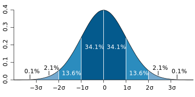
That is the typical Standard Deviation bell curve, with the typical percentages. The dark blue slices are 1 standard deviation away from the central mean, adding up to 68.2% and then the next 2 sections on either side of the mean add up to 27.2%. So the normal population distribution of data that is 2 standard deviations is 95.4%.
This is what Bollinger Bands seek to explain. By calculating volatility of a security and using 2 standard deviations for the upper and lower bands, they are explaining the potential odds of the amount of future price movement by two standard deviations! What Bollinger found was that about 88-89% of the movement was contained within 2 standard deviations. Not quite the normal distribution of 95.4%, but certainly close enough.
Why are Bollinger Bands so useful?
Fear and Greed. The base human emotions that drive the movement of the markets. At the extremes, huge runs up and huge crashes down, fear and greed are happily at work. Bollinger Bands seek to understand the amount and pace of these movements. You might look at them from the perspective that they set the expected boundaries of how far and fast these base human emotions can make the market move…either up or down, or for that matter, sideways!
What is also amazing is when the bands are actually “broken”, where the price of the security has extreme moves outside of an upper or lower bands, that is where they are actually the most useful! What other indicator can say?!
Bollinger Bands will help you become more rational, instead of reacting with the crowd, they provides insight about relative highs and lows that others might not see. When swing trading, most of the time, the most uncomfortable feelings are the ones you need to go with in order to make money.
At the end of the day, when you or I make a swing trade, we are buying when most are selling at low prices and selling when others are buying at high prices! It is an often uncomfortable feeling to feel like you are stepping in front of a moving train heading downhill. It also feels uncomfortable to step off of a moving train where everyone is having a party! Bollinger Bands seek to tell us whether the move up or down has run its course, or will continue onward.
Remembering that Bollinger Bands key objective are to seek to show whether a security is RELATIVELY high or low, cheap or overvalued.
If you remember one thing about Bollinger Bands, remember that.
The current price is the single point where all of the fear and greed and other emotions found a central point within a constant tug-of-war. You can use Bollinger Bands to see where exactly that price is and where it might be going relative to its past movements and recent volatility.
Here are the scenarios to describe the past movements of a security and its future potential movement:
- Has the price been going down and will go lower?
- Has the price been going down and will go sideways?
- Has the price been doing down and will go up?
- Has the price been going up and will go higher?
- Has the price been going up and will go sideways?
- Has the price been going up and will go lower?
- Has the price been going sideways and will go lower?
- Has the price been going sideways and will continue to go sideways?
- Has the price been going sideways and will go higher?
Those are the ONLY options. You can have only 3 prior movements and only 3 potential directions from there. THAT’S it.

Bollinger Bands are telling you where you have been, where you are currently and where you are likely to be going. It is an excellent map, showing where the current price is and whether it is considered HIGH OR LOW BASED relative to its prior movement as volatility.
When you are using Bollinger Bands, you have RELATIVE sense of the prior movement and where it might be headed. Sure the stock could be high, but maybe not relative to the Bollinger Bands. Or it might be very low, but not relative to the Bollinger Bands. You can use the bands to give perspective of where the current price is and where it might be going using volatility and standard deviation calculations.
Volatility: It moves in cycles
Stocks go up and stocks go down. Bonds go up, bonds go down. Exchange traded currency pairs go up and go down. Sometimes the price patterns can be very hard to predict.
There is one concept that is easy to predict. Guaranteed to work 100% of the time and that is this:
After a period of low volatility, there will be high volatility. After a period of high volatility, there will be low volatility. It has to happen. It’s the chicken and the egg. Its yin and yang. Expansion and contraction. It a cycle that has to happen…100% of the time!
For the most part, price is not cyclical or very forecastable, but volatility is. As long as humans are buying and selling between each other, we know that there will be times when all is calm, almost everyone agrees that the fair value of the price exists within a relatively narrow range. Then something changes. Maybe it’s a gradual mood change, driven by many small factors. Maybe it’s a major event that everyone reacts to. Either way, the calm narrow range gives way to a major shift in price. Volatility jumps.
Common Trading Methods Using Bollinger Bands
Swing Trading with Bollinger Bands: The Squeeze
It seems like “The Squeeze” is the most popular and talked about method of trading Bollinger Band patterns. Earlier we covered how Bollinger Bands are driven by volatility. When volatility increases, the width between the upper and lower bands increases. When volatility decreases, the distance between the bands narrow and decreases. Remember that everything happens in cycles and volatility goes up and down in cycles.
The Squeeze is defined by John Bollinger as a period when the volatility drops to the lowest level within the last 6 months.
This is the period where for the last 6 months; the distance between the upper and lowest bands is the tightest over the last 6 months.
The formula to calculate the distance between the bands…known as BandWidth is as follows:
Top Bollinger Band – Bottom Bollinger Band / Simple Moving Average Close
You can see that this is the mathematical way to describe the distance between the upper and lower bands that is so easy to see visually.
Once the distance between the bands reaches a new 6 month low, The Squeeze is on!
Here is a prime example of what the Squeeze might look like:
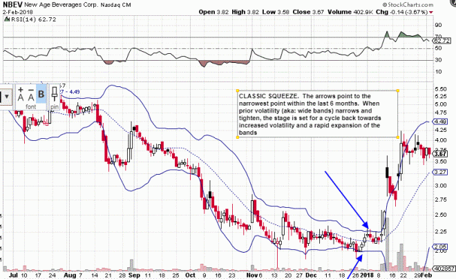
You can see here with this chart of NBEV, the price steadily worked its way lower and lower, and the overall distance between the bands expanded and contracted in ever tightening mini-waves. Then a period of relative calm started occurring in December, slowly tightening. Towards the end of this squeeze, the bands were so tight, that from the last two weeks of December, moving into January, they were almost parallel. Then all of a sudden there was an explosion of volatility. An explosion in price and the upper and lower bands expanded quickly away from each other in both directions.
That right there is a perfect squeeze where the price shot upwards after a period of low volatility.
Here is another chart of the squeeze…
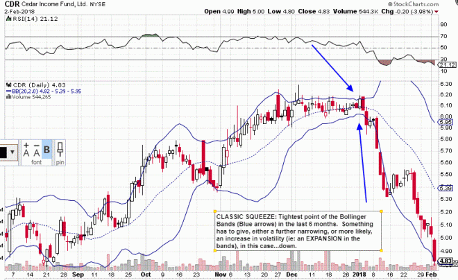
After periods of cycling volatility up and down the bands started to contract. Here at this point at the end of 2018, the bands had reached their narrowest point within the last 6 months. Obviously the price had risen quite nicely from the end of August and September up through the end of the year in December. Volatility started to tail off though and of course, the bands started to contract.
The two charts depict the exact same thing, a shrinking of volatility or a period of calm, followed by a sharp increase in volatility out of the blue. There is one obvious difference though, right? They are practically mirror images of each other.
One had been going down, and then fell sharply. One had been going up, then climbed sharply. How heck does one know which direction to take? Aaaahhhhh and there is the rub.
One common method is to quickly take the trade in the direction of the initial increase in volatility coming out of the squeeze. Sometimes though, there can be a “head fake”, which is an initial move in one direction, then a quick move back in the opposite direction of what turns out to be a sustained trend.
Therefore, because of this chance for a “head fake”, many traders wait to see the sustained direction and then take the trade. This has a much higher probability of success, but the tradeoff is the reduction in potential profit.
I have my methods that I developed based on the squeeze pattern that fit my trading style and what I feel comfortable with. You might come up with your own. Either way, using The Squeeze pattern is a highly effective and profitable way to trade using Bollinger Bands.
Swing trading with Bollinger Bands: The Reversal
Another very common technique, with a ton of variations and sub-methods is the reversal. This is simply a method to take the trade in the opposite direction of the previous trend, after the either the upper or lower Bollinger Band was touched or exceeded. One is simply looking at the pricing action and reversal price patterns combined with Bollinger Bands, and not using any other indicators.
Remember though, just because the upper or lower Bollinger Band was tagged or exceeded, doesn’t mean you are automatically going to have a reversal. It is just as common, and sometimes even more common to see a walking of the bands higher or lower.
In his book, Bollinger on Bollinger Bands, John Bollinger highlights methods developed in the past by Robert Levy and Arthur Merrill that simplify reversal patterns into 5 point W and M patterns. By smoothing out the many gyrations up and down into the major moves, it helps to classify the pattern. There are a total of 16 W patterns and 16 M patterns. Here are all possible combinations of bottoms (W patterns) and tops (M patterns):
M Patterns
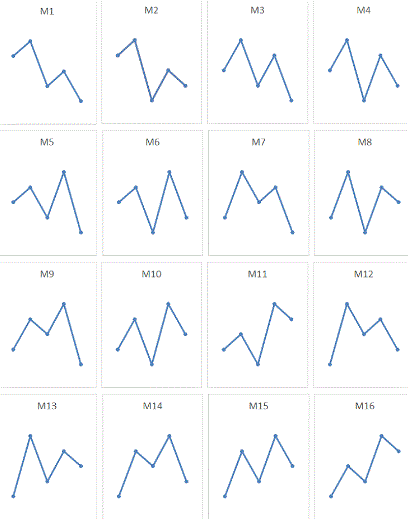
W Patterns
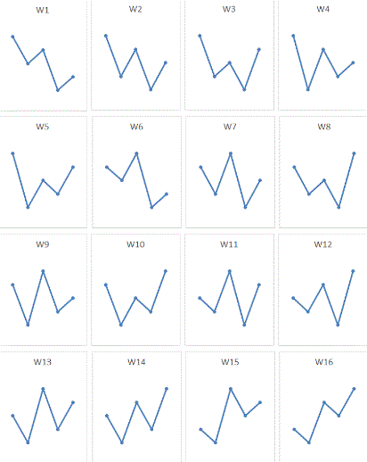
Combining Bollinger Bands with these underlying reversal patterns can lead to some highly profitable swing trades.
Let’s take a look at the chart below:
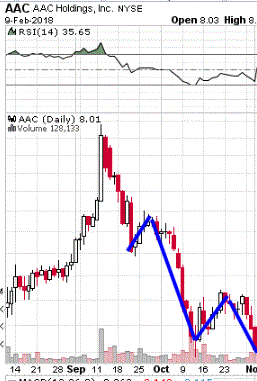
What pattern do you think that is starting to match? We had a short up move, a huge swing down, another short up move and then another downward move. The key here is that the last move down was had a LOWER LOW than the prior point.
I would start to classify this one as a W2 pattern here, even though we don’t yet have the final move:
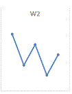
The key here is a lower low. Who is to say that this current down trend isn’t going to continue? After all, the price is freaking lower than the prior low? How much farther can this thing go? It could keep going lower and might completely break down.
Well, here’s what actually happened. Take a look at the 5th move, completing the pattern:
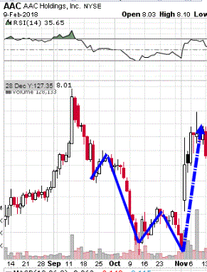
Wow, did it this thing bounce hard or what?! If you were to simply look at the prior action, focusing on the fact that we had a LOWER LOW, one might think that this thing is not looking good. Might get a small bounce, might head lower, but overall, having a lower low like this isn’t a good sign, right?
But here is where Bollinger Bands really shine.
Remember, Bollinger Bands can tell us in a relative way, is the price high or low RELATIVE to itself based on its volatility?
Well, let’s add Bollinger Bands to this same chart and see if this stock, AAC, was high or low relative to itself.
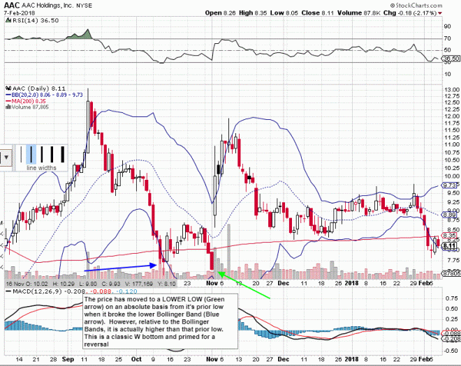
Here are the Bollinger Bands overlaid onto the same chart. Take a look at that blue arrow I drew on the chart. The price had a low and BROKE the lower Bollinger Band. It then had a move up, then down again and had the lower low. But look at where the price is RELATIVE to the lower Bollinger Band? It might have had a lower low, but it is now ABOVE the lower Bollinger Band highlighted with the green arrow. It might have a lower price (of course), but it is HIGHER relative to the Bollinger Bands!
Also, notice how the lower Bollinger Band is COMING UP to meet the price. That is quite a bit different than the prior low, where it broke the lower band, but the lower band was still in a downtrend…the stock is still sick. While we had a lower low, this time it was inside the lower Bollinger Band and the signs were that the move was ending because the lower band was curling up.
Amazing stuff isn’t it? This is the key to understanding how to use Bollinger Bands for swing trades!
Swing Trading with Bollinger Bands: Using Indicators
Combining Bollinger Band analysis with indicators can dramatically increase the accuracy of your profitable swing trades. On their own, Bollinger Bands are great. Combining them with indicators can make them even better! Indicators can add additional insight and provide additional evidence about where prices are heading. If you have a favorite indicator that works for you with your swing trades, experiment how they interact with Bollinger Bands on your potential setups.
I have several that I like to use and listed a few here.
Here we have the MFI indicator overlaid on the chart of ACBI below. The MFI is basically a volume weighted RSI indicator. I also have the RSI on the ribbon at the top of the chart.
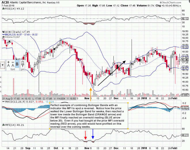
Take a look at how this dog of a stock, ACBI is basically just “walking the lower band” for about a month! Take a look though at the MFI indicator. During the walk down the lower band, it was not anywhere near the oversold line of 20. The MFI indicator was telling you not to buy at any point along the way. This thing was not showing any signs of turning around.
However, around the start of November, you can see it had a brief dip into the oversold line (RED arrow), and then again a few days later (BLUE arrow). Not only that, the price was lower than the prior lows from before, but now was INSIDE the lower Bollinger Band. This would be a higher percentage chance of a profitable entry point. Look at what happened…we had a turnaround (finally) and a sustained move into the $17 – $18 range.
Here is another example, this time using just the RSI indicator:
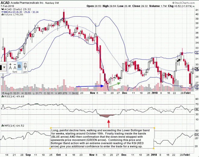
What a drop, right? Notice how ACAD started moving lower in October, touching the lower band and meandering down and down. None of those would be buying points if you also look at the RSI. It’s not in the oversold territory. Then we have sharp moves down during the first half of November had sharp drops, with small candlesticks along the say. One might be tempted to enter along the way, hoping for a reversal, but look at how the lower Bollinger Band was still straight down and the RSI still not oversold.
Finally we have the oversold reading (RED arrow) towards the middle of November. Couple this with the price finally starting to move sideways and slightly upward is telling us that the downtrend was starting to end. Here is a higher percentage entry point for a swing trade, with the price moving from $27 up to $31.
One thing to note…don’t just blindly buy where the RSI reaches oversold territory. Do you see how it would have paid to combine that with how the price interacted with the Bollinger Bands? Waiting to see if the price was finally done moving off that sharply declining lower band was the key with this trade. When you see a few bars occur, moving inside the lower band, combined with the fact that the indicator is telling you to buy, that is the time to buy!
Putting it all together: Using Bollinger Bands for Swing Trading
I’ve been swing trading for quite some time. I’m not an expert, just a regular guy, trading part-time while working a full-time job. Over time, I’ve honed in on what works for me. It’s taken some time and in many ways has been a long road.
Tons of reading, tons of learning…and tons of mistakes!
Bollinger Bands have helped me greatly in deciding what to buy, when to buy and when to sell. I love how they graphically overlay onto the price action, expand and contract and giving a sense of whether the current price is high or low on a RELATIVE basis. Call me biased, but I think they’re beautiful! Ha!
Behind the simple beauty of the bands is a statistical foundation that captures almost 90% of the potential moves a price can make. I like those odds. I like knowing that behind those bands, there is a foundation, a statistical foundation that is telling me whether I am about to buy a stock at a RELATIVE LOW or sell a stock at a RELATIVE HIGH.
Through most of this article, I’ve been describing entry points. Also, remember that Bollinger Bands can tell us whether we’ve reached a relative high. I’ve been using Bollinger Bands to help me determine if it is time to get the hell out or continue holding. It sucks to sell a stock, only to watch it continue higher. It sucks to buy a stock, only to watch it continue lower.
Are they always right? Hell no. Do I make mistakes? Yep. Do Bollinger Bands help understand when to buy and when to sell? 100% of the time.
I encourage you to add Bollinger Bands to your analysis of whether to enter a potential swing trade and when to exit a potential swing trade.
Let me know how it goes! Also, if you could take the time to sign up to get alerts when I make a post like this, I would appreciate it!
Let’s stay in touch!
- Sign up for my email list. [Opens new browser]
- I’ll send you the password to a page that contains the top free tools I use every single day to find the best stocks to trade.

Dear Sir,
I thoroughly enjoyed reading your article as you have put the matter succinctly.
Thank you.
LikeLike
I really like the way you describe things. SIMPLE AND CLEAR
never thought what lies behind indicators in technical analysis and made it simpler for us not to blindly follow the herd.
thanks
LikeLike
Thanks Alex. Glad the post was helpful to you. Glenn
LikeLike
Thank you! Great article.
LikeLike
This was very clear and inspiring as well as the parts on swing trading, I’m liking it a lot. I would always jump in swing trades only off of candlestick reversal patterns and wonder why it wasn’t working the greatest. Need indicators to help solidify my analysis!!! Thankyou
LikeLike
Really enjoyed this post – thanks for explaining it so well.
LikeLike