Have you ever given thought to taking trades based upon price action alone?
Have you ever taken a chart and:
- Removed all of the moving averages?
- Removed the indicators?
- Even removed the volume?
Do you think you would be able to still trade effectively?
That might be a bit extreme, but when you really think about it, moving averages, most indicators…they all derive their existence from one thing: PRICE
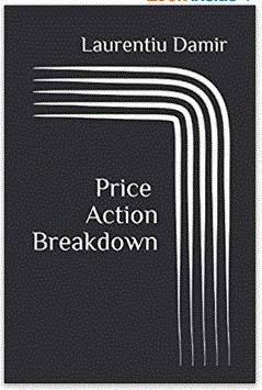
Laurentiu Damir, in his book, Price Action Breakdown, takes an in-depth dive into analyzing the pricing patterns on charts in a very unique way. The way he analyzes price charts is unique. I have not seen some of the concepts that he describes anywhere else.
You will not find discussions on the typical technical price patterns either. He dispenses with the need for ascending wedges, cup-and-handle, head-and-shoulders formations, etc. With the methods he utilizes, learning the myriad of price patterns is unnecessary.
After you read this book, one thing will be clear:
You will not look at a price chart in the same way you had before.
Of course you don’t need to trade on price alone, or forget traditional technical price patterns, volume and indicators…but if you employ his thought process and understand the behaviors behind price action on the charts, you will be better off because of it!
I just want to cover just a few of the concepts that he discusses in the book by taking a chart and breaking it down using a few of the concepts he describes in his book.
The Concept of “Value areas”
Take a look at this chart of ATRA:

You can see that we had a trading range between around 14 and 17.5, had a huge breakout, then moved into another trading range between 35 and 50.
Laurentiu would call these trading ranges “value areas”.
This is because in these boxes, though the price is fluctuating back and forth, there is a general agreement between buyers and sellers about the value of ATRA. There is a stable market for the price inside of those shaded boxes.
- At the top of the range, sellers come out of the woodwork in greater numbers and/or with more intensity near the top and towards the bottom, buyers become fewer in number and less confident.
- The sides switch at the bottom, with buyers becoming more confident and numerous towards the bottom, and sellers less confident and fewer in number towards the bottom.
One key point here:
He doesn’t care about having the box incorporate ALL of the trading activity, just the majority of the pricing action!
We are just finding what is considered to be the VALUE area…and that’s what we have with those two boxes.
Now…look again at that huge jump out of the lower value area! Something happened to cause sellers to dry up and buyers to take over and bull the price way up. Obviously some type of great news event for ATRA (I don’t care and didn’t even bother look into the reason for the jump).
In that section of the huge upward move, we don’t have much of a value area. This is not a stable, orderly market during the timeframe where the huge upswing occurs. Obviously, with whatever the news is, we know that the value area around 14 to 17.50 isn’t valid anymore. Most buyers and sellers both agree that the price should be higher.
Based on the event/news, ATRA surely needs to be valued higher…who knows where…but certainly higher, right?
Turns out buyers and sellers ended up sorting things out and we have a general value area between 35 and 50. Notice with that upper box…I don’t have it enclosing the lower initial dip in early February. I want it to enclose the majority of where the price has traded.
So at this new value area, the market has become more stable, with a general consensus that $35 and $50 is a reasonable range of value. Same back and forth movement occurs near the top and bottom.
Within these value areas, a majority of the volume has occured
Take a look at the same chart, but with the volume by price pinned to the left:
This is the same chart of ATRA, but with the volume by price added.
Here, the volume within the specific timeframe of the chart, is sliced and organized by price. It is then added up in the bars you see on the left and placed where the price occurred. Here you can see that a majority of the volume has occurred at the pricing within the trading range between 35 and 50, and very little along the huge move up from the lower value area.
The point of this chart, and the concept that Laurentiu is describing in his book, is the fact that there is stable, agreed upon “fair” price within the value area. That is where most of the volume occurs…where buyers and sellers are comfortable with their purchase and sales.
What is interesting about this chart, is how the largest volume by price is towards the middle of the value area (I’ll touch on this in a bit!).
Ok, let’s break things down even further!
The concept of a “control”

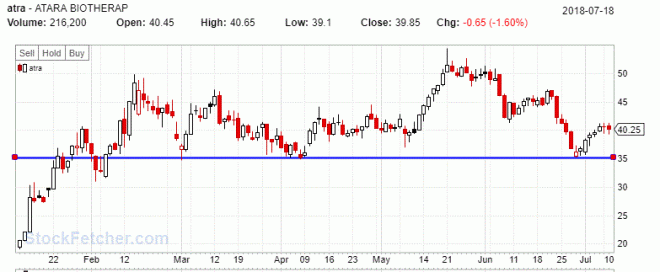
Here is the same chart of ATRA, but with the traditional support line one might draw at around $35. Standard stuff, right?
Now let’s start adding some of Laurentiu’s concepts to this chart by changing the support line to a box…

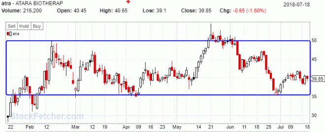
Here is the same chart with a box that incorporates a majority of the trading range. The bottom of the box is exactly where one would draw a traditional support line, like the earlier screenshot. Notice that at the top of the box, I didn’t move it all the way up to incorporate ALL of the extremes that occurred in late May. Laurentiu simply wants the box to enclose a majority of the range (the value area).
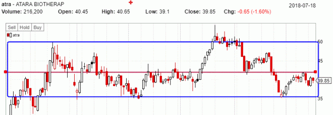
Now, I’m going to show you with the chart below with what Laurentiu calls the CONTROL price within this box:
 That red line there is the “control”.
This is an area within the value area box that is typically towards the middle, and is almost like a magnet for the price, pulling the price up from below, and down from the top of the value area.
You could also think of it as the rudder in the middle, steering the ship/price during it’s time within the value area.
It’s amazing how you can take almost any chart, find a value area, and sure enough…there is the control.
Laureantiu didn’t exactly discuss one particular point about why the control exists, but I think a major reason is this:
Human nature tends to overreact, moving from one emotional extreme to the other.
Fear and greed.
We tend to overdo things. That’s why we have the business cycle, with booms and busts. But somewhere in the middle, that’s where we should be. And that’s why the control exists. There is more agreement there between the extremes.
Remember that volume by price chart from earlier? Here is it is…at that control price. A large part of the volume has taken place at the control. Likely for 2 reasons:
- Obviously because the price has spent a good bit of time hugging that control line…so there is volume there.
- Maybe the volume has been higher at the times when the price is near the control, than away from it.
Notice how the price pauses, with closing and opening prices right around that control?
The concept of EXCESS price
So I’ve given examples above with the ATRA chart of general “value” areas.
Inside those value areas, there is always a “control”
Next, Laureantiu also describes his concept of “EXCESS” price. These are areas where the price has traded above or below the general value area.
The key is to look at how the price has behaved when it moved outside of the value area. This can give you a clue about the strength of the buyers and sellers.
Look at the same chart that we’ve used above, but in the example below, I’ve highlighted two areas of excess price.

The green circle is iniative buying. Here sellers tried to push the price below the value area (remember, at this time in February, the stock had a huge move up and the battle was raging about whether this huge move would hold or not).
First the sellers pushed it down with that big red candle.
next, buyers stepped up and pushed it back in with a huge white candle. Then you can see the strong move continued up to the $50 area, which turned out to be the top of the new value area. So at this point, one could assume that going forward, there would be a strong floor in this new value area.
Next, look at the red circle. That is a huge tail, isn’t it?
During that one day, the stock traded well above the value area, but sold off hard and was pushed back down. A rejection of any move higher. That’s not a good sign.
With this stock, we have a horizontal value area. If this was a uptrending stock, that would be a pretty big warning flag. If this were an uptrend, a huge wick like that above the uptrending value area could be a sign that the trend might be ending.
In this case of a horizontal value area, it is still not very positive to see that. By analyzing the candlesticks of “excess” value, one might be able to tell whether the price will continue to remain in the value area.
There is another concept tha Laurentiu covers in his book that might indicate whether a security might move above or below a value area.
With this particular stock, might be about to drop out of this value area.
The location of trading activity within a value area
Where has a majority of the trading activity taken place?

Here you can see that I’ve highlighted the bottom of the value area below the control.
In this case, it’s clear that the price has spent more time trading below the control than above it.
If this were a upgrending value area…that would be a warning flag. In the case of ATRA’s horizontal value area above, this still doesn’t look too promising.
Look at how it struggles to get above, with only a few sharp moves up. Also, remember that we had that wick in the red circle with a big move during the day that was swiftly batted down.
Recently, here in June 2018, the stock moved off of lower part of the value area and wasn’t able to get above the control price…again. It will be interesting to see where this goes, but if I were to guess…this stock is going to breakdown out of the value area because:
- The huge wick (red circle), rejecting with authority any move higher outside of the value area.
- How the majority of the trading has been below the control
Maybe you could make a note to track what happens to ATRA (I know I will).
Summary of Price Action Breakdown
This is a unique book with concepts that I think will definitely help with your trading. It has helped me by forcing me to think about the price action without using typical technical analysis tools that in many cases, are simply crutches.
Also, by dispensing with the need to memorize tons of technical patterns and incorporating concepts of value, by think about of simple supply and demand, you become more flexible and less rigid with your technical analysis.
In this blog post, I’ve highlighted only a few of the concepts from the book (which he covers much more in-depth). There’s much more to learn, including signs to look for when a trend is about to reverse and how to establish the new value area and control for the new trend.
I think Laurentiu Damir is legit.
- He’s a FOREX trader who lives in Romania (I think).
- He doesn’t have a website to sell trading memberships our courses (I don’t even think he has a website). He simply doesn’t care…he just trades.
This book is direct and to the point (103 pages), without needless fluff. His writing is not flowery, but simple and direct. English is not his first language and it shows here in this book.
Some might find that irritating, expecting perfect grammar and chuck the book or give it a snarky review on Amazon. That’s silly, because those that do that are sure to miss out on valuable and unique ways to profit from the concepts in the book.
I actually find his writing charming, in a way.
In any case, I hope you learned something here and if these concepts are interesting to you and you think can add value to your trading, check out his book!
Also, let me know your thoughts on this post (and the book).
Good luck with your trading & talk to you soon!
-Glenn
My Top 5 Free Trading Tools
Access a list of the Top 5 tools that I use every day to find and analyze the best swing trading opportunities.
P.S. – I just added an extra resource that turned my trading career around.


